Think you can’t use a warehouse because you have spreadsheets? Think again…

Our Data Engineer, Adam Sulier, walks you through this step-by-step process of building a Data Portal with your spreadsheets!
The Data Portal. We at Inciter hear this term all the time, but what does it actually mean?
Usually, it is brought up in search for some elusive solution to a data collection and reporting problem, “We need a data portal.” Unfortunately, this term doesn’t actually refer to a defined process, or a specific technology. Each case is different, but after examining our clients’ specific needs, and asking the right questions, we discovered a common thread.
First, they were looking for some sort of cloud platform, to make it easy to upload and manage their data. Second, they needed some sort of database in the cloud to house the data. This database not only serves as the place where their information will live, but it’s also “where the magic happens”. The technical processes that clean up the data, and make it valuable would all happen here. Behind the scenes, and out of the minds of the end user. Finally (third), that valuable data and information would automatically flow to reports, which the stakeholders could easily access and understand. The whole process would happen live, automatically, and without the need for any end user to manage any overly complicated or technical process.
This cloud platform and the database that we are describing is really just a data warehouse with ETL capabilities (Extract, Transform, Load). When we start talking about cloud warehouses and “ETL” to our clients and the end users of “The Portal'', they may already feel intimidated. But it doesn’t have to be intimidating. Many individuals may feel pretty lost when it comes to setting up, managing or even just utilizing a cloud database, let alone an entire data warehousing infrastructure. But most of these same individuals are probably already utilizing simplified, user-friendly versions of these tools. For instance, Google Drive, Google’s free, easy to learn file storage software is a Cloud Platform! A relational database, at its core, is just a collection of tables that can be connected. Tables are more or less spreadsheets. Luckily Google has a great spreadsheet software that most people already know how to use. Finally, there are a lot of really great data visualization software on the market now. We have decided to use Metabase (which is an open-source data visualization and analytics tool) for many of our clients and for the purposes of this demonstration. However, we have also implemented other options, like PowerBI and Tableau for our clients as well.
Demonstration
Let’s build one of these data portals using the tools we discussed above. In this scenario, we’re working with a hypothetical organization that tracks workplace accidents that result in worker injury. This organization also receives grant money to assist women who are injured while at work. The organization and grant are both fictional, and the data has been created for the purpose of this demonstration. The eligibility criteria for the grant and the rules for how the money is distributed are purely hypothetical
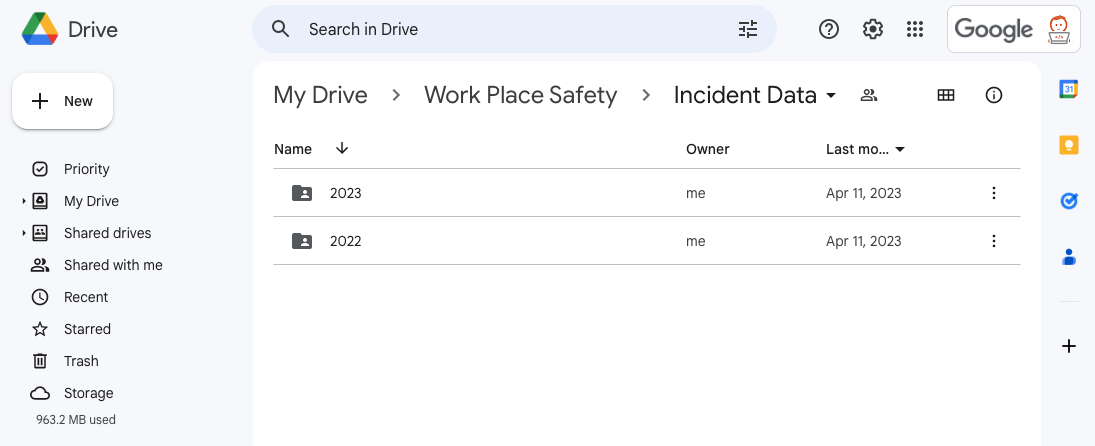
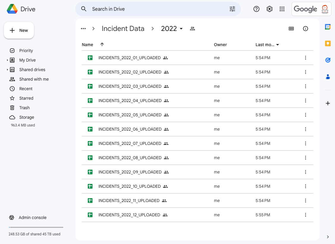
Step One: The first step is to determine a structure for how we will organize the spreadsheets, Google Sheets, within Google Drive. We created the folder “Work Place Safety” within the drive to house everything. Then we created the folder “Incident Data” where we can upload all of our files of workplace incidents. These are reported monthly, so we decided to have a sub folder for each year.
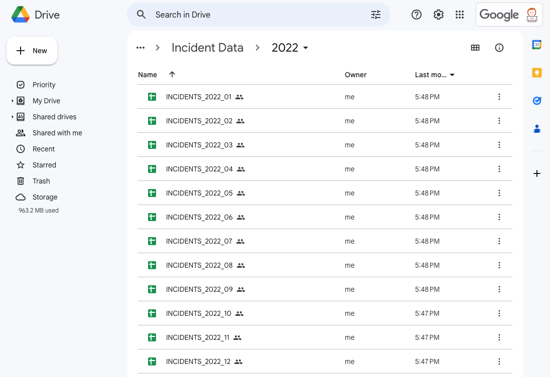
Step Two: In the 2022 folder, we can see there is a file that has been uploaded for each month of the year, and they all follow a consistent naming convention. The specific structure and naming convention you choose to organize your Google Sheets within the drive may be different than this– it probably will be different, data source to data source. The important thing is that you choose a structure and naming convention that works for your data, and can be consistent as you continue to add new data.
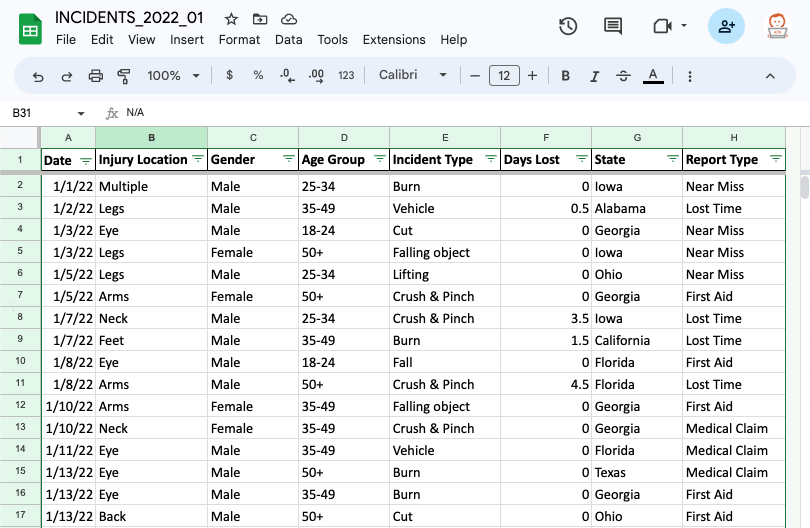
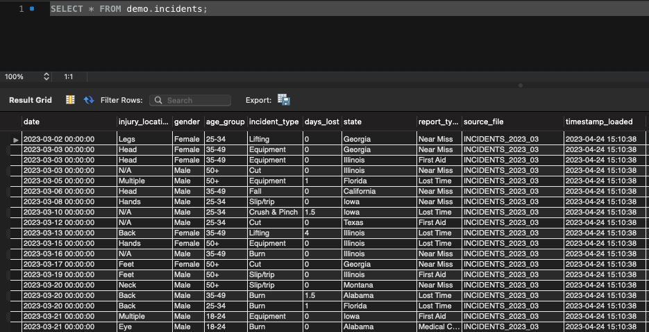
Step Three: Let’s click into one of these files. Here we can see what some of the actual data looks like. The table we create in our database will follow this exact format.
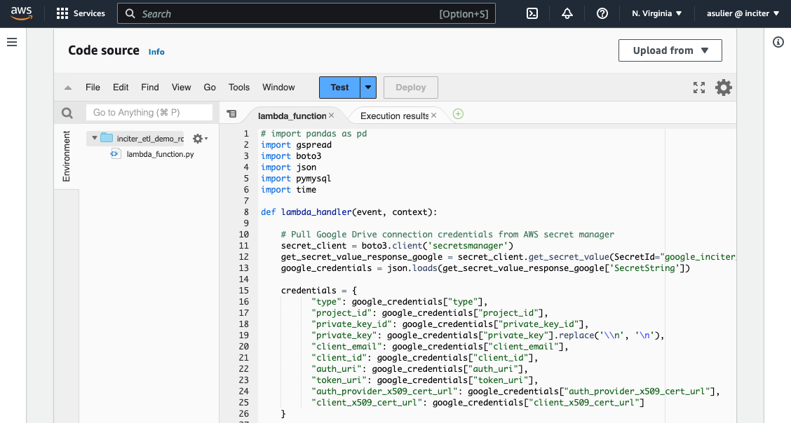
Step Four: Now let’s go behind the scenes, and the code source behind this data loading program. We’re utilizing an AWS Lambda function, written in python, which connects to Google Drive utilizing Google’s API to grab this data. Once it pulls it out of Google, it places it into the backend database. This code is scheduled to run every night, but can be scheduled more or less often. Don’t worry if this part is starting to feel a little overwhelming, a “Portal” user will never need to see this part.
Step Five: If we take a look into the backend database, we can see some of the data that has been loaded from our Google Sheets. Here, we are using a simple SELECT statement SQL query to view the data in the backend database. The format of the data here is exactly the same as what we entered into the Google Sheets, and any changes made in the Google Sheet will automatically be pushed to the database here on the back end. The only update you may notice is that we've added 2 columns here so that it's easy to track which sheet the data came from, and when it was loaded into the system.
Step Six: If we go back to that 2022 folder in the Drive, we will see that the Lambda function has gone in and processed each file, and it lets us know it did so successfully by appending “_UPLOADED” to the end of each file.
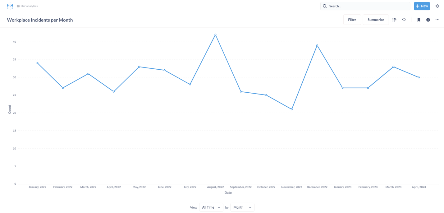
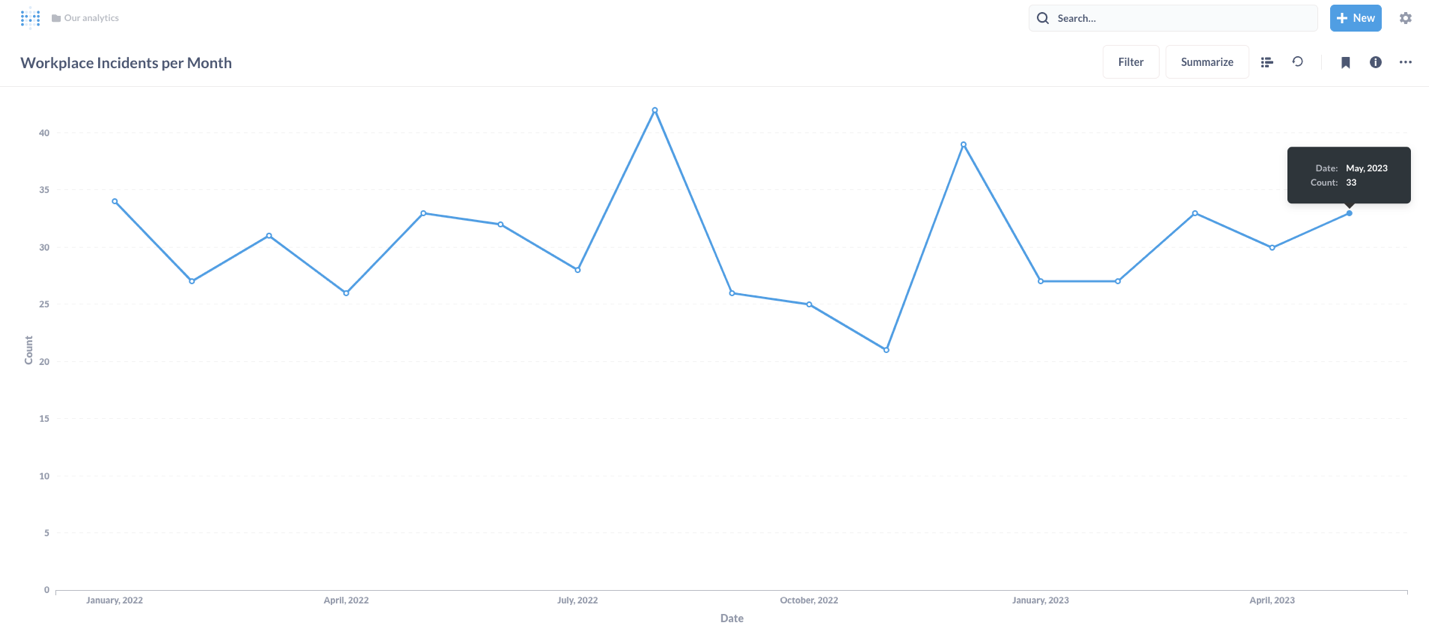
Step Seven: Now that we have our data in a database, it's simple to connect it to a reporting tool, and build whatever dashboard and reports we can think of. This screenshot below is from Metabase, which is an open-source BI dashboarding tool. Other options are PowerBI and Tableau, and there are countless others that can connect. We can see a quick summary of all of our data that we’ve loaded so far, a quick count of incidents per month.
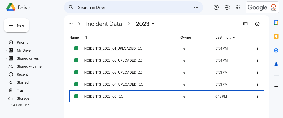
Step Eight: Let’s fast forward a month: May is over and we need to add the data for the month. We can go directly into the 2023 folder. You can see all the previous files are already in the system, as we go in to upload May’s data.
Step Nine: The “Portal” takes care of everything, and as you can see, our reports are automatically updated with the new data.
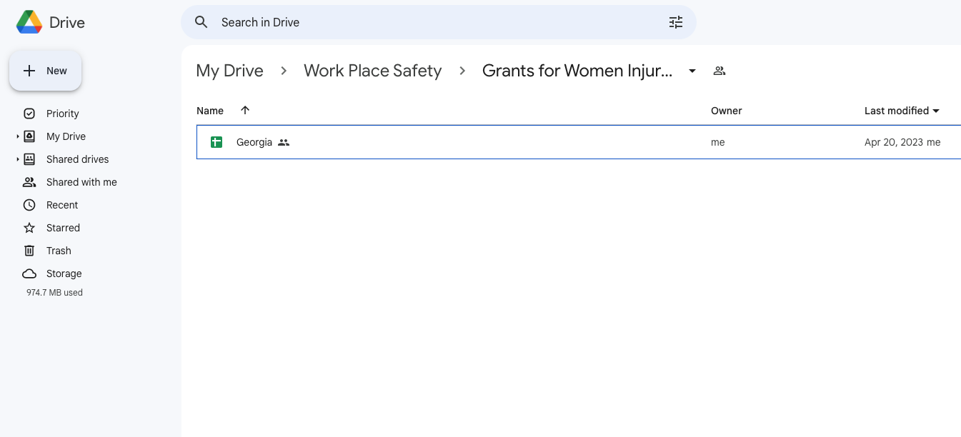
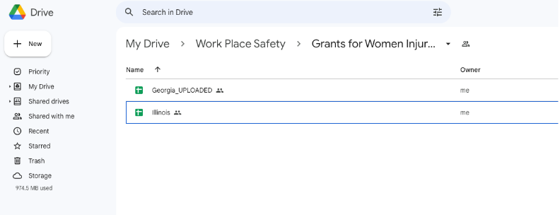
Step Ten: Now that we have one dataset up and running in “The Data Portal,” let’s add a second data source. We can create a new folder titled “Grants for Women Injured” within our “Work Place Safety” folder to house the grant data. This data is organized by participating states (and as of right now, Georgia is the only state participating).
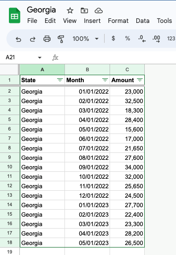
Step Eleven: Let’s see what the data looks like in the “Georgia” file. The table is structured so that we just have the total amount of grant money available for that month.
Step Twelve: We will update our lambda function so that it knows how to handle the Grant data. This only needs to happen when a novel source of data is added. This won’t be necessary to add new data to an existing source.
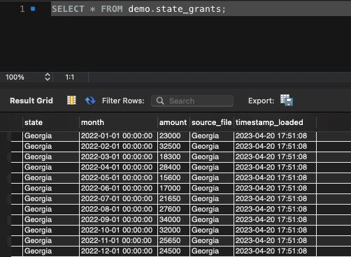
Step Thirteen: If we look back into the backend database again, we can see this data was added to the table.
Step Fourteen: Now that we have multiple sources of data, Incidents and Grants, this is where having a real database in the background becomes very powerful. We can make these tables talk to each other. We’ll do this by creating a new table called a “view” by joining together the information in the two sources we’ve loaded. Note, If you just want to be an end user of the portal, feel free to skip this part, as this code is something you’d never need to think about. Here is the SQL code that creates the “view”, which tells us how much grant money on average was available to each woman who was injured in that state. If you're familiar with SQL, you can see that this code looks into the incident table, filters for only women who were injured (ignores men, ignores ‘Near Misses’) and counts those up by month, and organizes the results by state. It then finds the grants for each month and attaches that number to our count, and finally finds an average amount of grant money to be allocated.
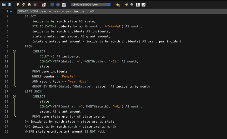
Step Fifteen: Now, let's take a look at what that view looks like. This view creates a newly calculated measure that will be calculated automatically, whenever new data is input into the system.

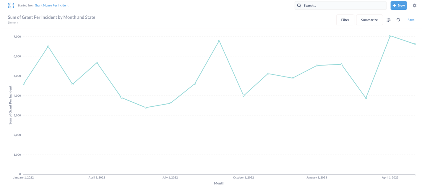
Step Sixteen: We can send this newly calculated metric straight to our reporting tool. Once this data makes its way into Metabase, we get a clean report that tells us month by month how much grant money on average was available.
Step Seventeen: Moving forward, the state of Illinois has also been participating in this program, and they’ve just sent us their data. We’ll add their file to Google Drive next to the previously processed Georgia Data.
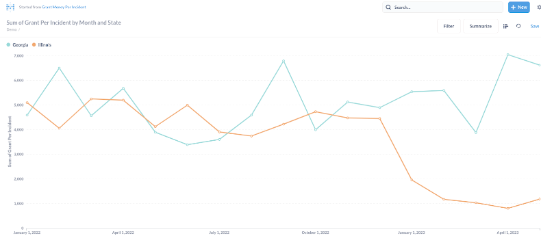
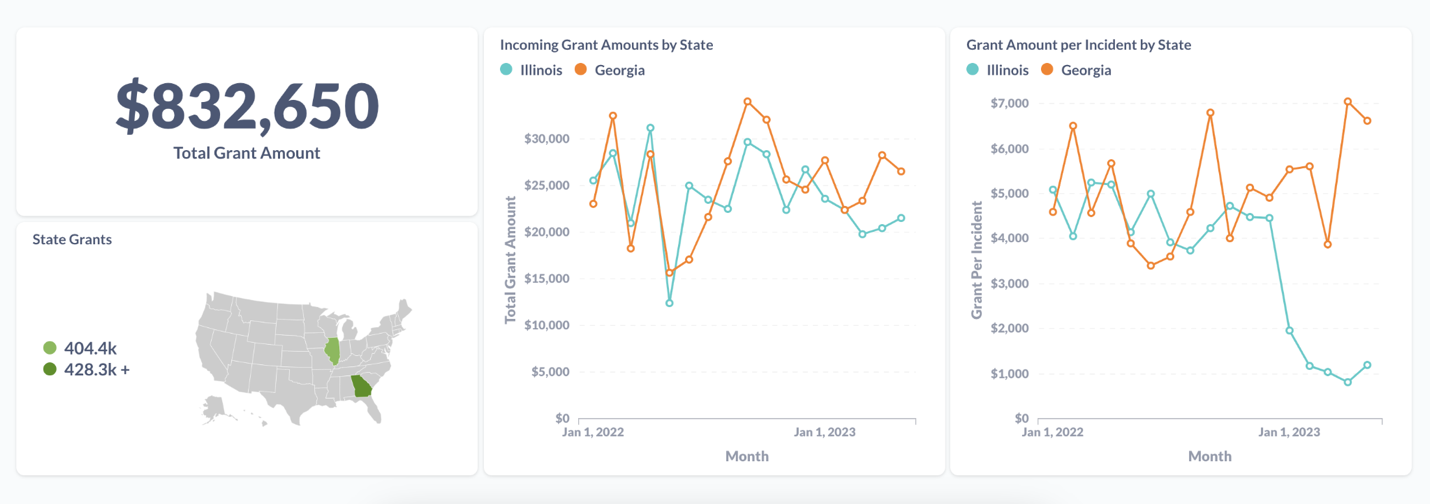
Step Eighteen: The new data will automatically flow through “the Portal” and our reports will update. All of the data processing and analysis happening in the background can give us instant insight into our data. This graphic was generated, without our analyst having to wrestle with pivot tables, or manually pour over rows of data to calculate metrics for us. And we can immediately see some trends: Usually, we were able to distribute on average well over $3,000 to each woman injured in 2022, and in Georgia that trend continues. But in Illinois, in 2023, this average dropped significantly to around $1,000. Now we know there is something worth looking into here... Did our funding in Illinois go down in 2023? Were there more injuries? We can use our reports to look into this and try to identify the source of the problem, and find a solution!
This is just the beginning of the insight you can pull from your data, once you get it into the database.
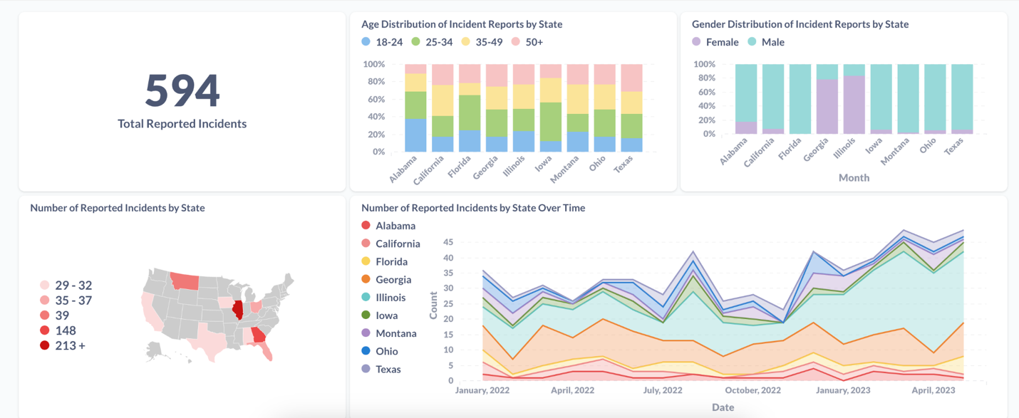
We had our analyst, Karen Wang, spend an afternoon putting together a quick dashboard in Metabase with this data, just to explore what’s possible. You can check out some of her visualizations and reports below:
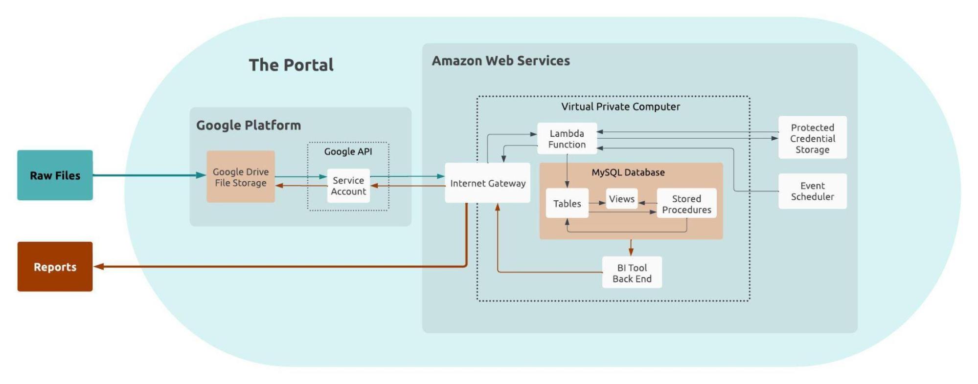
Now to summarize everything that we’ve touched on, here is a flow diagram of what's actually happening with “the Portal”.
It may look complicated at first, but once this is up and running, everything in the blue oval happens behind the scenes and is fully automated.
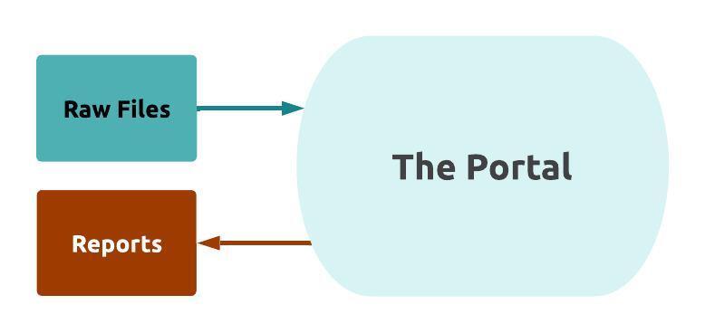
To an end user, this complicated process boils down to just raw files going into the Portal, and reports coming out. If we go back to what we thought our clients wanted when they asked for a “Portal”, we can see how this simplified process maps directly to their needs.
You can also watch Adam’s recorded presentation from GoodTechFest on building a Data Portal here!
And next month we'll pick back up with our Data Governance series! Sign-up for our newsletter to receive the next post in your inbox!
Recent posts

The Nonprofit Case for Data Warehouses

What is a Data Warehouse and is it the right option for your organization?

Sustaining Data Governance: The Crucial Role of Tools and Technology
Let’s work together!
Most nonprofits spend days putting together reports for board meetings and funders. The Inciter team brings together data from many sources to create easy and effortless reports. Our clients go from spending days on their reports, to just minutes.